
I’m a UX Designer focused on creating clear, intuitive digital experiences that reduce complexity and help people accomplish real tasks with confidence.
Before moving into UX, I spent over 15 years working in architecture, visual art, and design. That background shaped how I think about structure, systems, and human experience — skills that naturally translated into user-centered digital design.
Working across disciplines and cultures taught me to listen carefully, think visually, and design with empathy. I bring this approach to user research, user flows, wireframes, and prototypes — aiming to make complex interfaces feel logical, usable, and calm.
What motivates my work is understanding how people interact with systems — and improving those systems so they serve users better. I enjoy tackling practical problems, from simplifying booking flows to improving clarity in content-heavy interfaces.
Outside of UX, I paint in my studio, play tennis, experiment with AI tools, and explore cities with a camera — constantly observing how people navigate spaces, both physical and digital.
UX Case Study
Hotel Booking Platform
“Enhancing user experience for efficient hotel bookings on desktop.”
Project overview
Booking a hotel should be smooth and stress-free — yet many platforms overwhelm users with cluttered interfaces, hidden policies, and unclear pricing.
This project focused on redesigning a desktop hotel booking experience for users who prioritize location, cancellation flexibility, price transparency, and booking efficiency.
Objectives
- Create a calm, structured experience for searching and booking hotels.
- Provide clear, upfront information on cancellation policies, pricing, and amenities.
- Enable confident decision-making through easy comparison.
- Minimize unnecessary scrolling and reduce visual clutter.
The Process
- What problem are users facing?
- What did we discover through research?
- How were these insights translated into design?
What is the problem?
Booking a hotel online can often feel overwhelming. With many platforms offering similar services, users struggle to find and compare key information such as price, location, cancellation policies, and amenities. The booking experience is frequently cluttered, unclear, and filled with distracting upsells — making it difficult for travelers to feel confident in their decisions.
To better understand these challenges and uncover user expectations, I conducted surveys, interviews, and observational research during the discovery phase.
Online survey
INSIGHT 1
65% prioritize location and free cancellation
INSIGHT 2
58% said scrolling and information overload are major issues
INSIGHT 3
50% experienced unexpected fees at final step
Benchmarking

To understand the competitive landscape and identify UX opportunities, I conducted a detailed analysis of four major hotel booking platforms:
✔️ Booking.com ✔️ Hotels.com ✔️ Agoda.com ✔️ LuxuryEscapes.com
Key findings:
- Booking.com stood out for its usability and transparency.
- Other platforms often hid key information or lacked visual clarity.
- None of the sites provided a clear, cohesive flow from discovery to decision to booking.
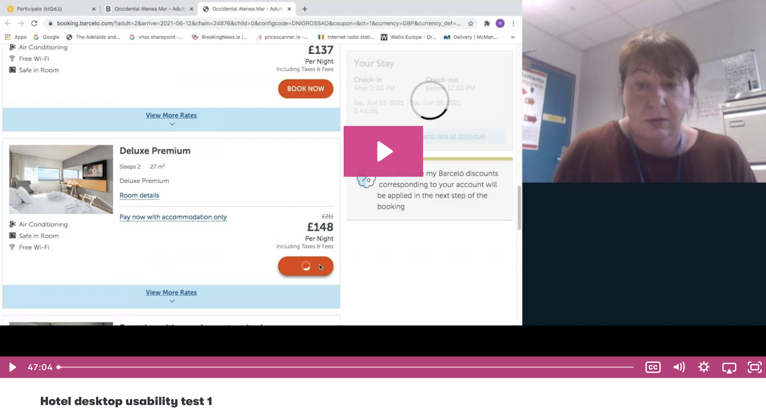
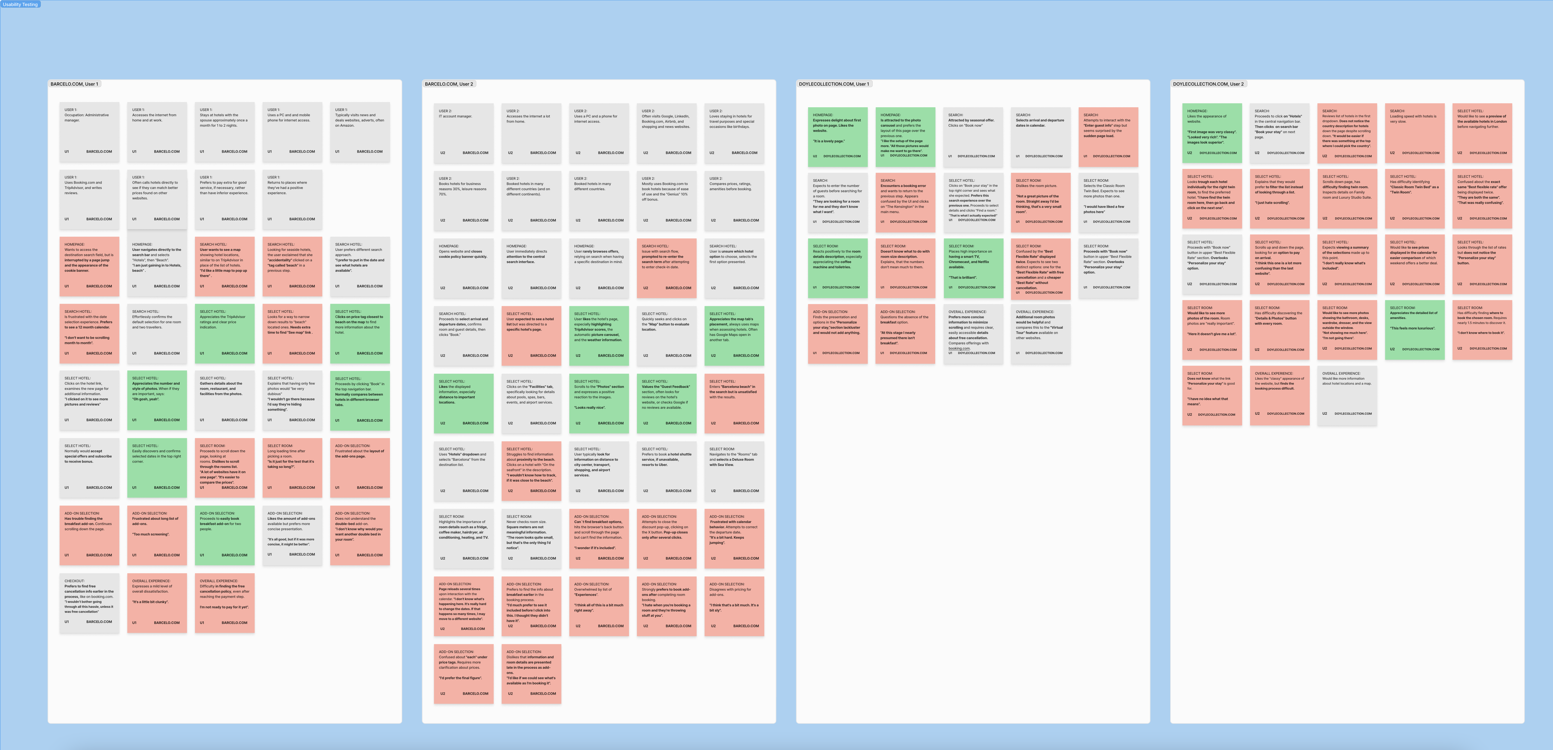
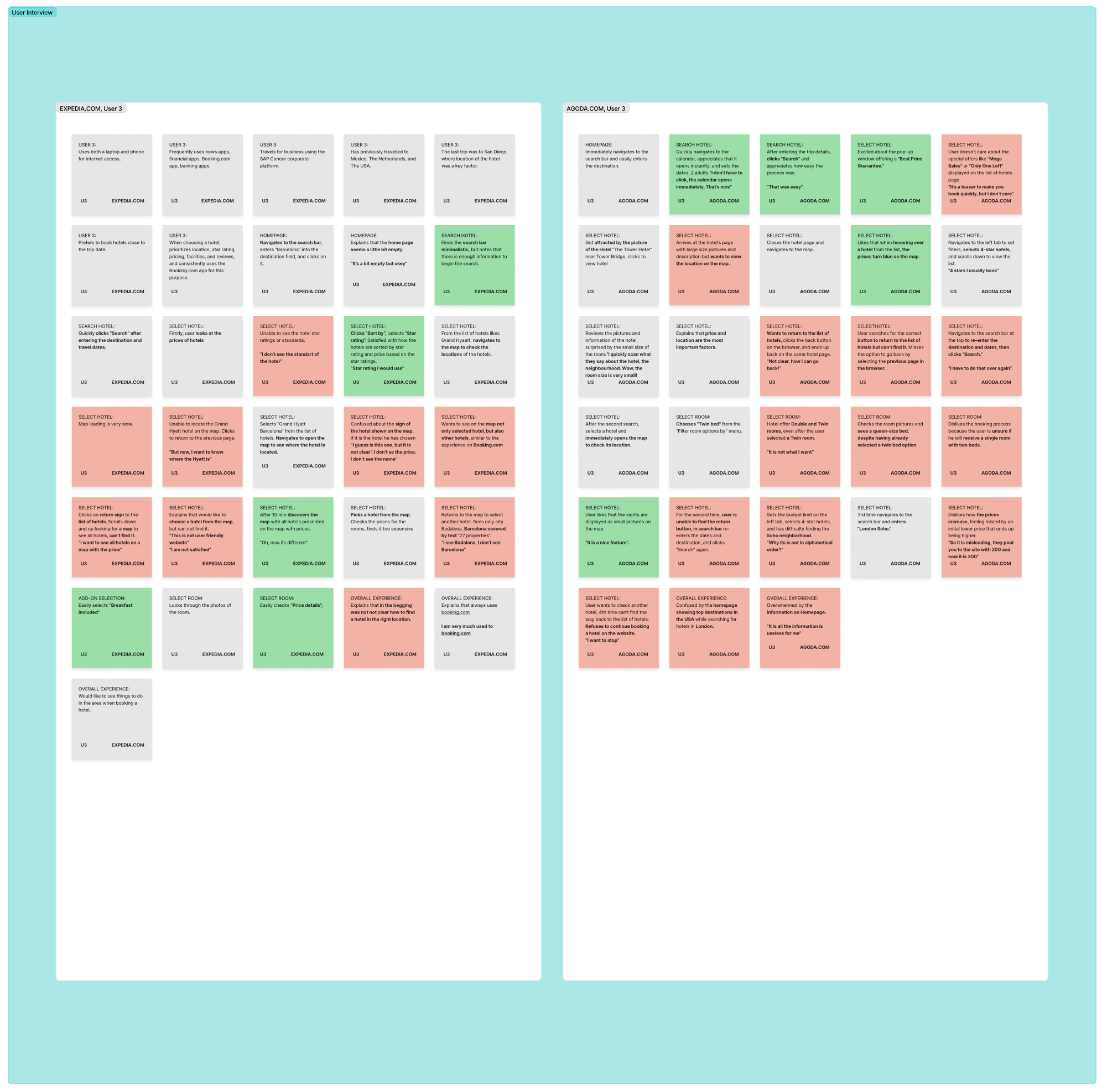
Usability testing
To evaluate real-world user behavior, I conducted and analyzed four usability test sessions on desktop, focusing on the hotel booking experience across Barcelo.com, DoyleCollection.com, Agoda.com, and Expedia.com.
Session Analysis:
I observed and note-coded video recordings of users as they completed booking-related tasks. Each session was structured by key stages in the journey:
Homepage → Search → Hotel Selection → Room Details → Add-ons → Booking Summary.
This approach helped identify usability issues, navigation challenges, and moments of user hesitation or confusion at each step.


Key Findings:
- High-quality hotel images significantly influenced user trust.
- Clear and accessible cancellation terms were essential for confident decision-making.
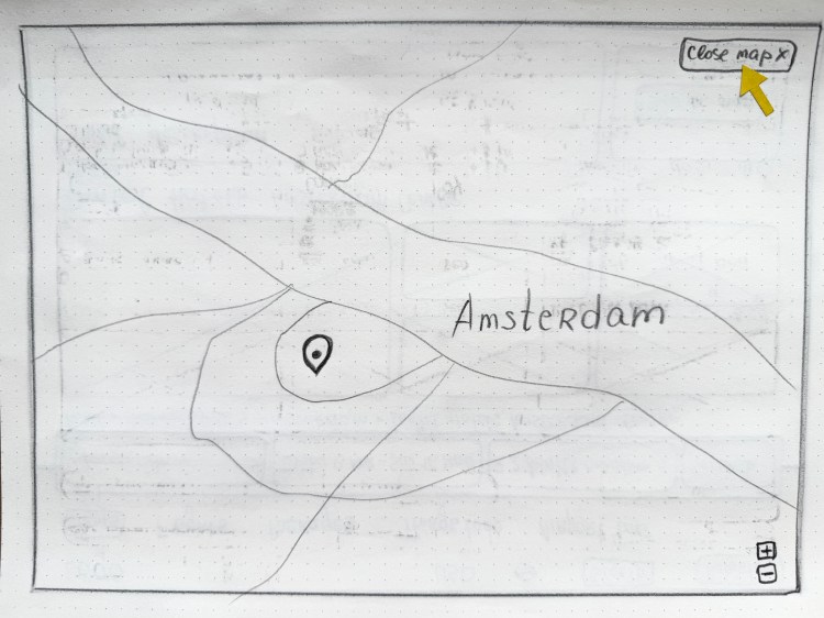
- Easy access to maps and location previews greatly improved usability.
- Users preferred a guided, step-by-step experience with visible progress indicators.
Conclusion:
The usability tests highlighted how even small interaction details — such as button labels or summary placement — can strongly affect user confidence. They also reinforced the importance of clarity, consistency, and reassurance throughout the booking journey.
Card sorting
To improve the information architecture, I conducted card sorting exercises to understand how users naturally group and prioritize hotel features.
The results informed a more intuitive navigation structure, making it easier for users to access key details and make informed booking decisions with confidence.
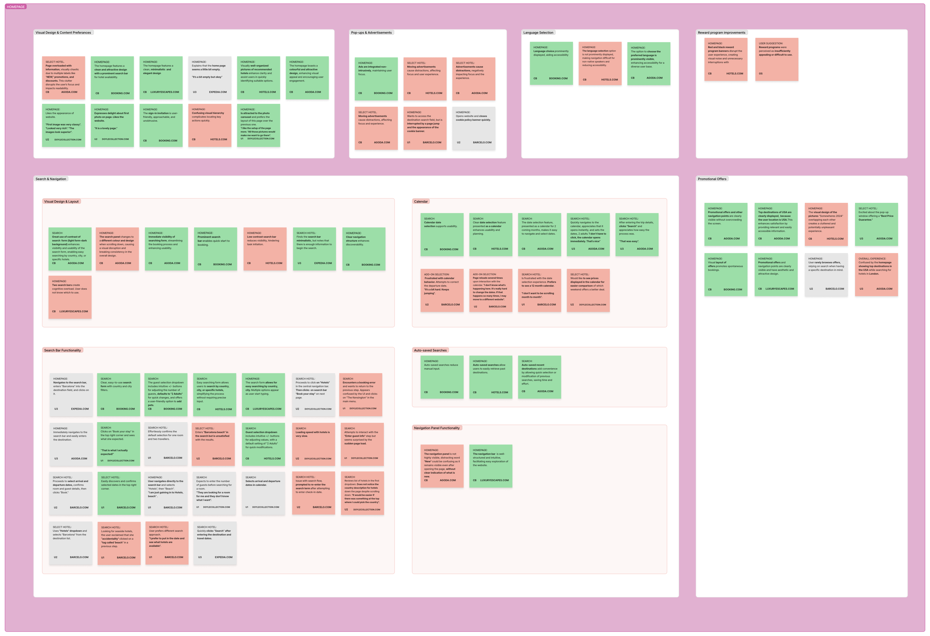
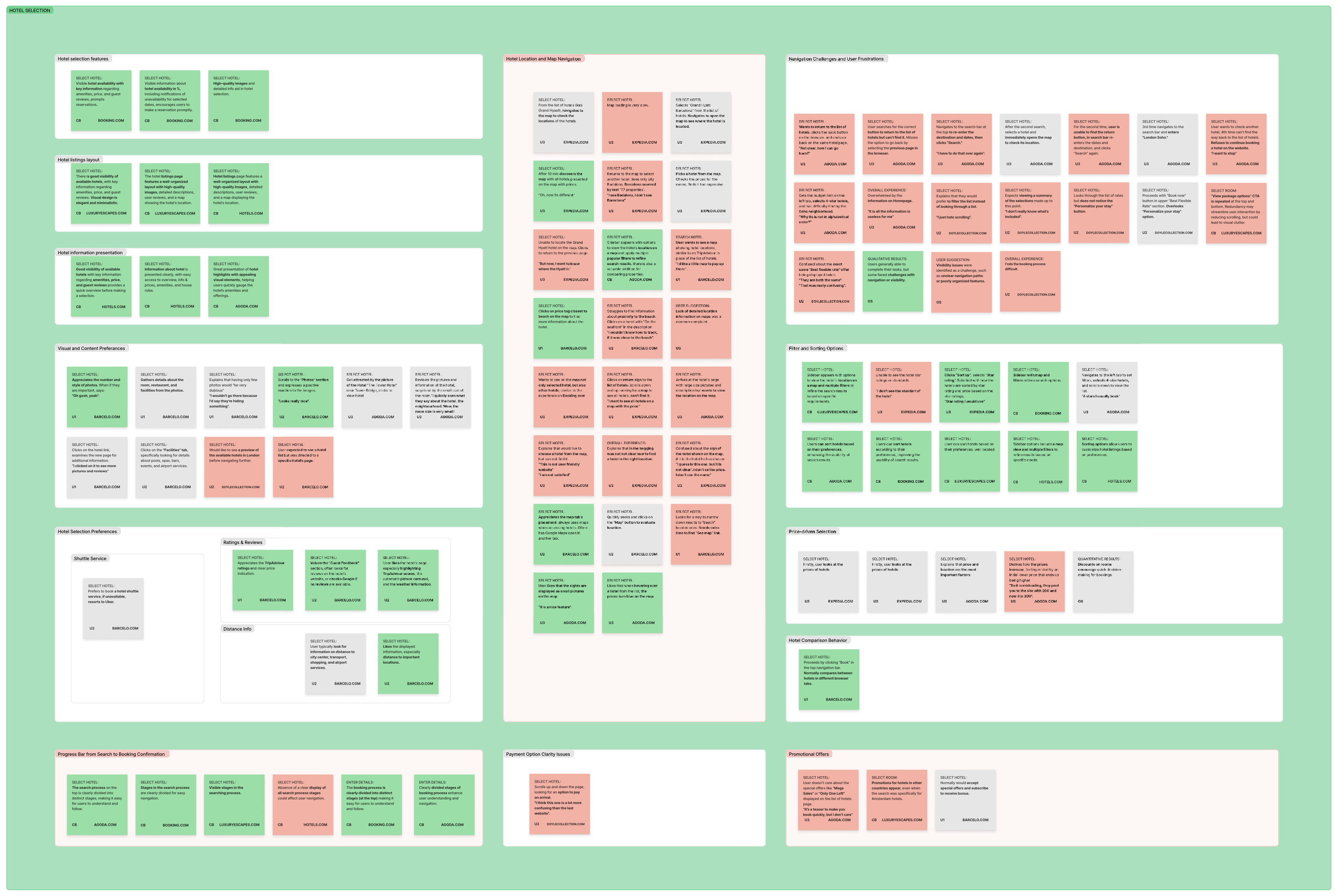
Affinity diagram
To synthesize user feedback and identify recurring themes, I created an affinity diagram. This helped organize insights into actionable design priorities.
- Users want a quick, at-a-glance summary of each hotel to speed up decision-making.
- Clear hotel cards with visible cancellation information are essential.
- Users tend to drop off when key details are missing, unclear, or unnecessarily repeated.


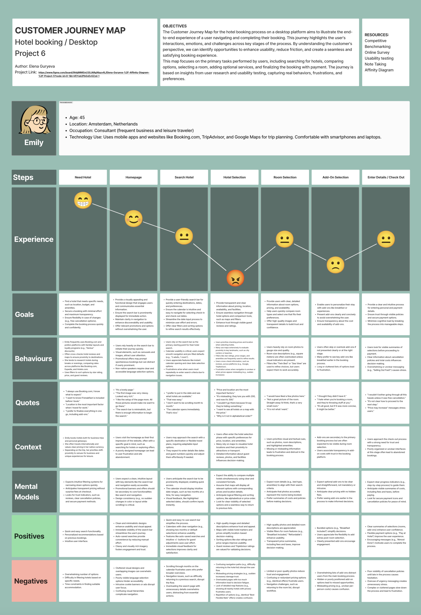
Customer journey map
I visualized the emotional journey of users during the hotel search and booking process to identify pain points and opportunities.
🔻 Stress levels peaked when users had to switch between hotel detail pages to compare options.
🔺 Satisfaction increased when a clear booking summary and progress indicator were available.
These insights helped prioritize features that reduce cognitive load and support decision-making with confidence.
What we learned from our research
Observations and insights:
Most participants had used hotel booking websites within the last week or month, indicating frequent engagement and high reliance on these platforms. Users consistently gravitated toward familiar services such as Booking.com, Hotels.com, and Expedia.com, basing their decisions primarily on price, location, and user reviews. A recurring theme emerged: users are looking for a faster, clearer, and more personalized booking experience.
Key pain points
- Important information (e.g., breakfast, parking) is often hidden behind multiple clicks.
- Interfaces frequently feel cluttered and overwhelming, especially during search and selection.
- Cancellation policies and refund conditions lack clarity and consistency.
- Users want to compare multiple hotels, but side-by-side comparison is rarely supported.
- The booking summary is often delayed or incomplete, leaving users unsure of the total cost.
- Platforms introduce unnecessary add-ons too early, contributing to decision fatigue.
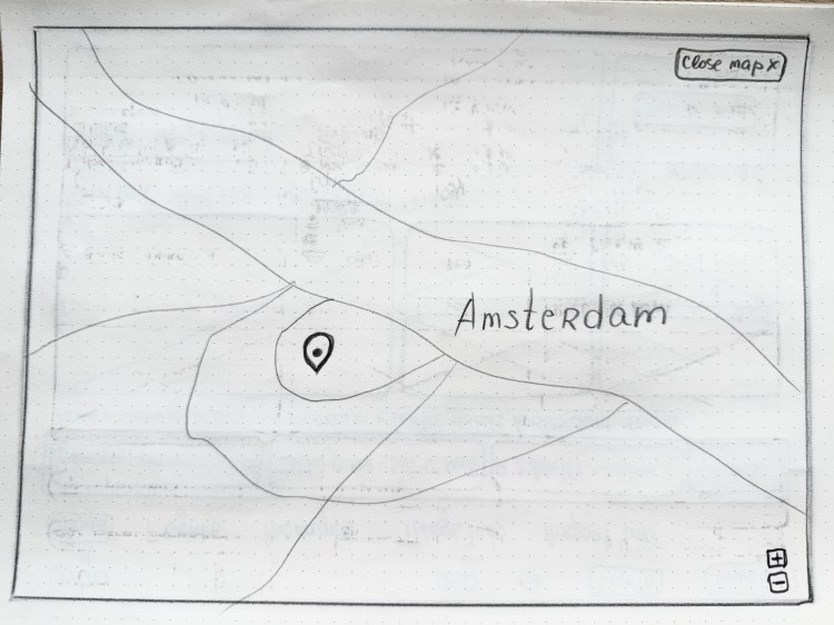
- Limited map access makes it difficult to quickly assess a hotel’s exact location.
Let’s design It!
With clear user needs and pain points identified, I began translating insights into design. My focus was on creating a simpler, more guided experience that addressed frustration with hidden details, comparison limitations, and cluttered layouts.
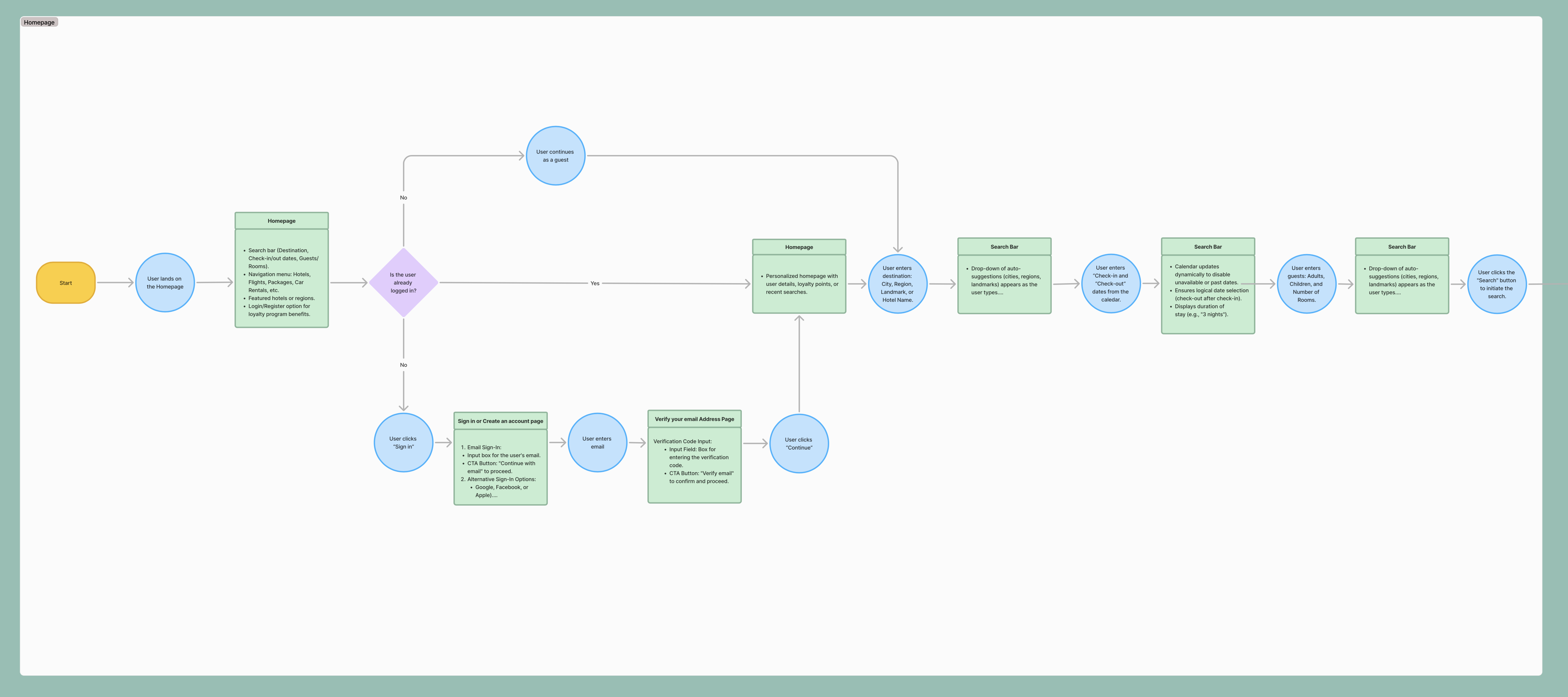
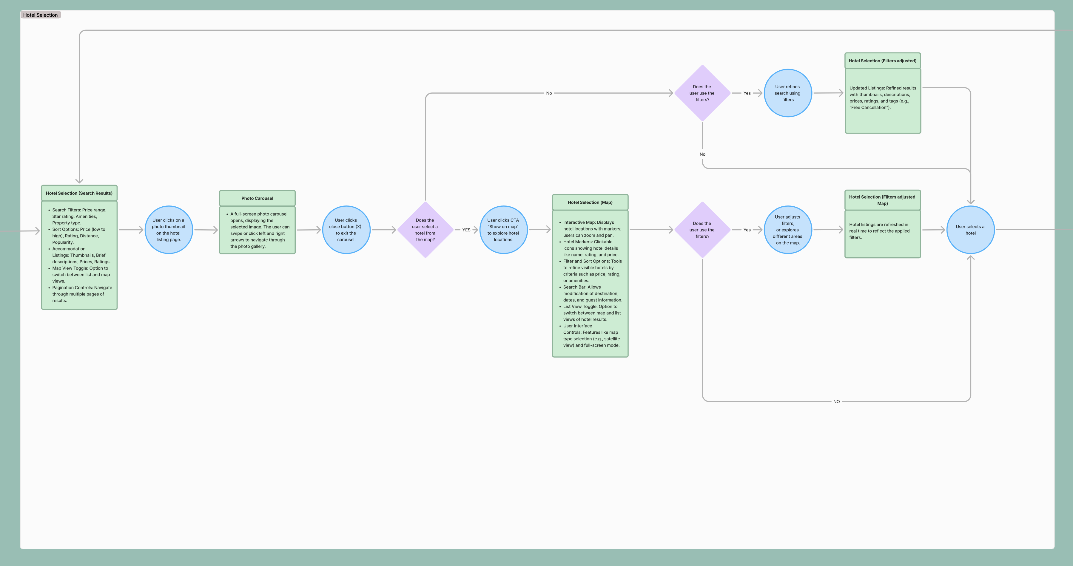
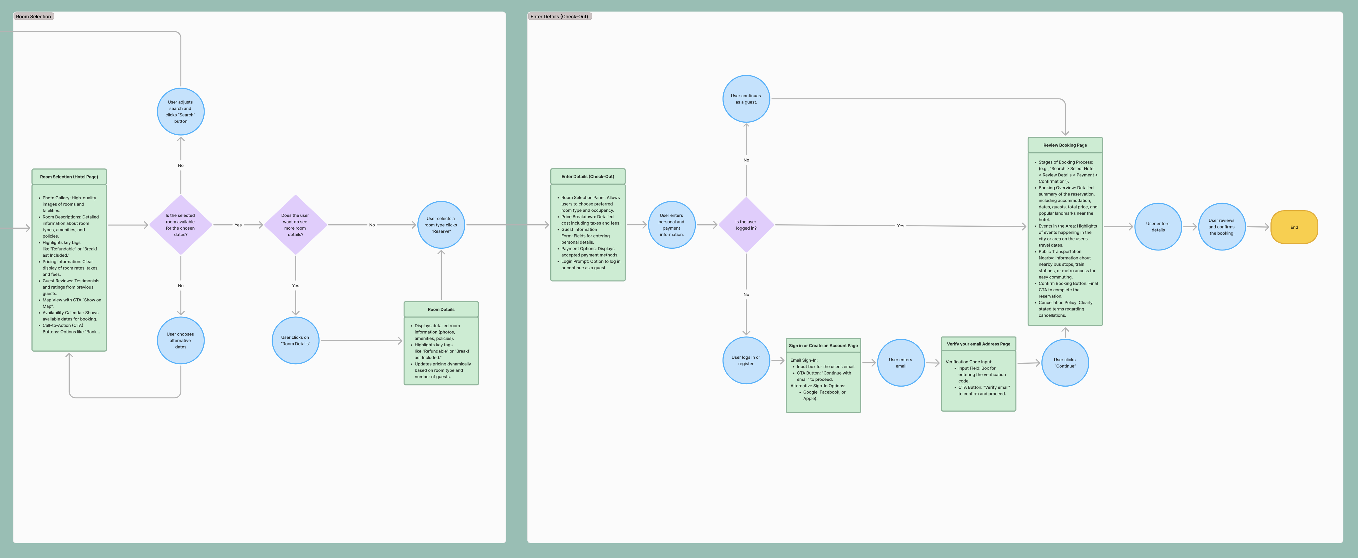
Flow diagram
I created a complete user flow in Figma to visualize the booking journey from initial search to final confirmation.
The flow was designed to minimize uncertainty, reduce friction, and prevent unnecessary loops or dead ends.
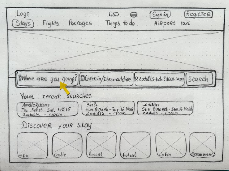
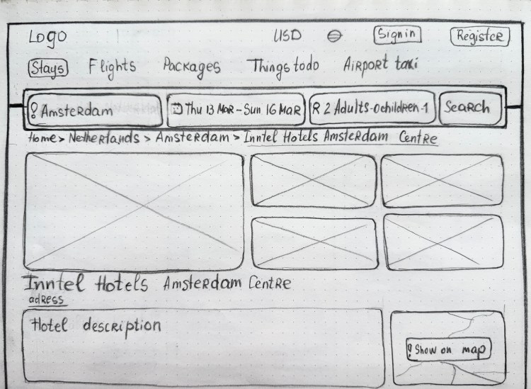
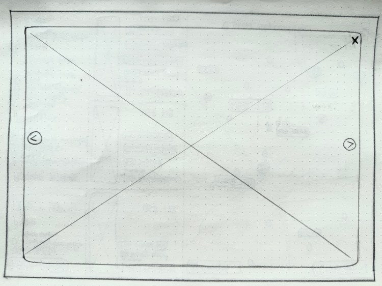
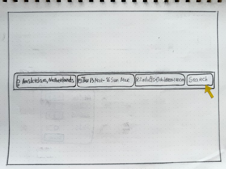
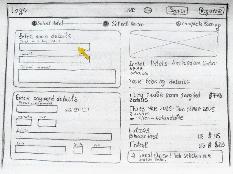
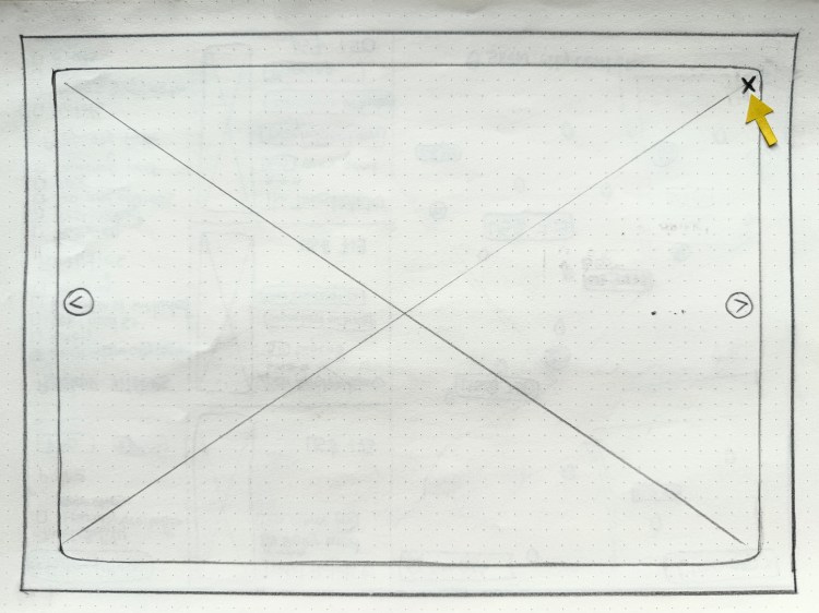
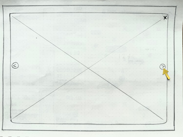
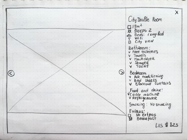
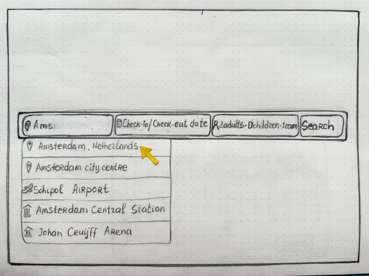
Sketching & Flow
Building on insights from our research, I began with low-fidelity sketches to explore layout options and key interface concepts for the booking experience.
This early ideation phase focused on simplicity, clarity, and user guidance, allowing for rapid iterations and early feedback before transitioning to more refined wireframes.
The sketches emphasized layout clarity and sidebar structure, with a strong focus on intuitive navigation and a clean content hierarchy.

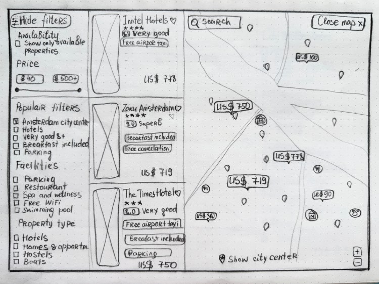


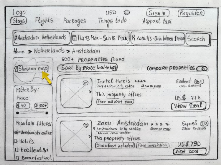


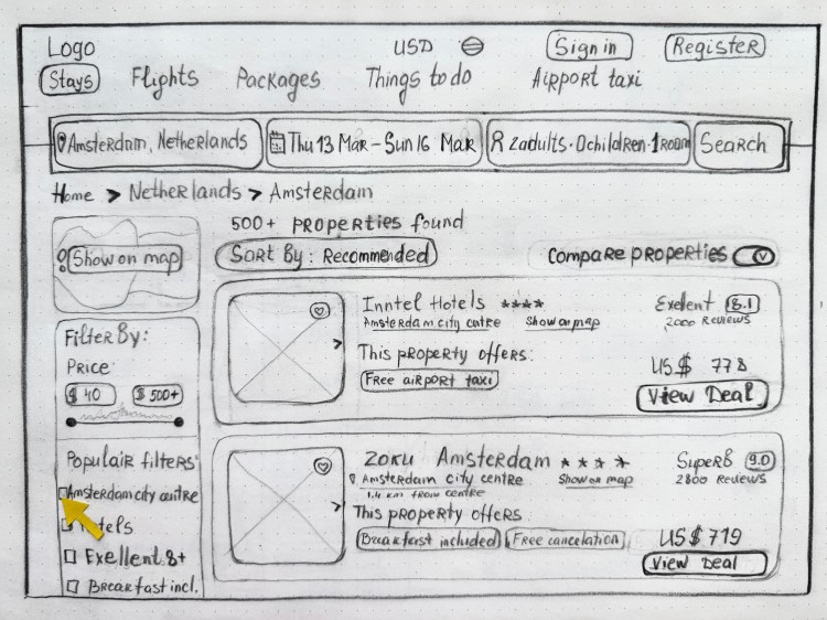


Flow included:
Search → Results → Hotel Selection → Room Selection → Booking
This flow was designed to be intuitive and efficient, minimizing friction and guiding users step-by-step from their initial search to final confirmation.
Interaction design
During the ideation phase, I created sketches to explore various layout options and design concepts for the booking interface. This rapid prototyping allowed for quick iterations and the collection of feedback before moving into more detailed design phases.

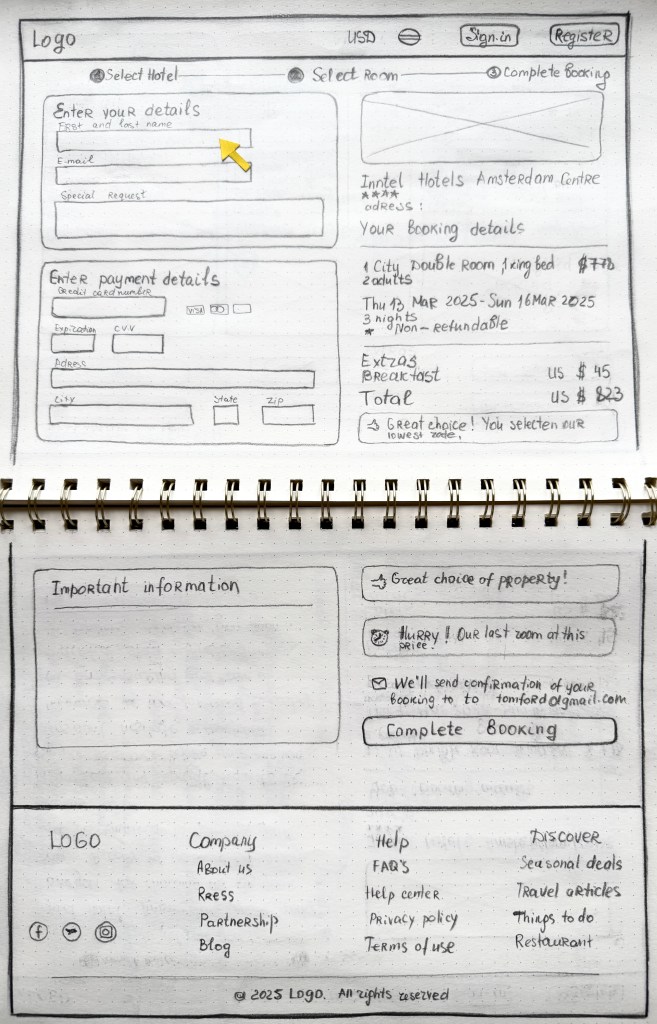
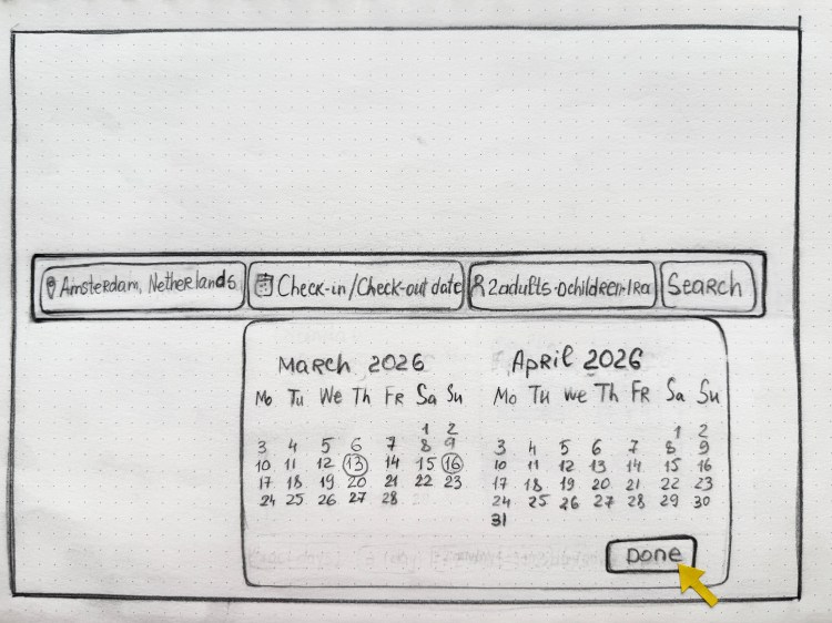
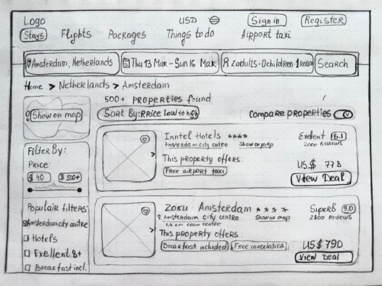
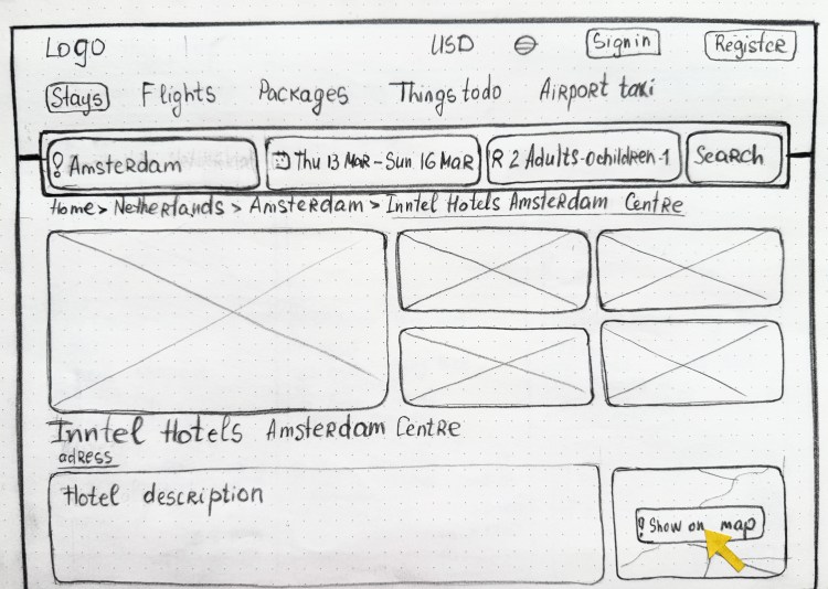
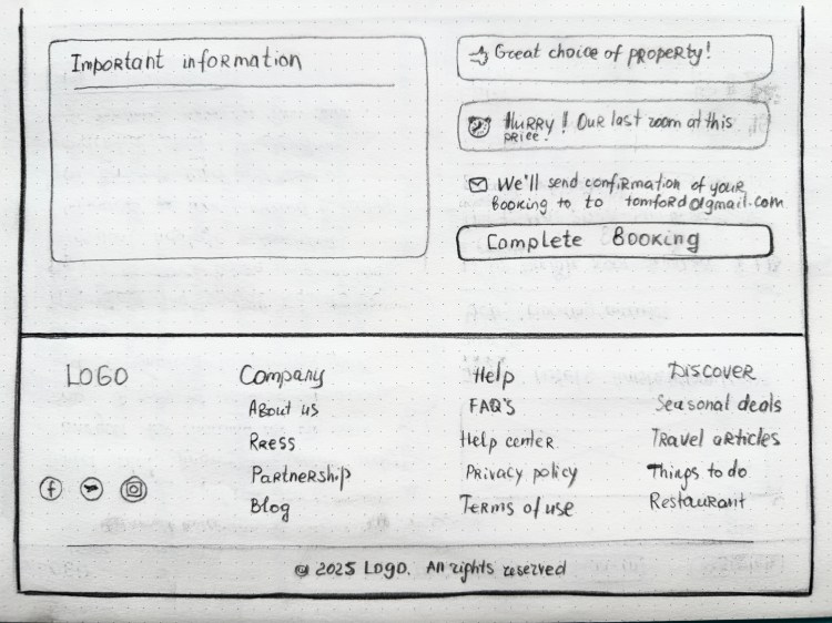
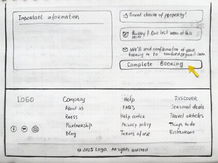
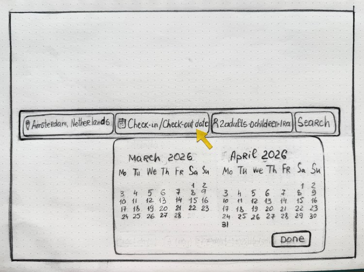
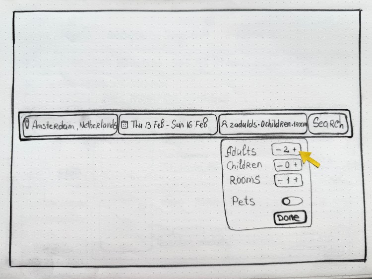
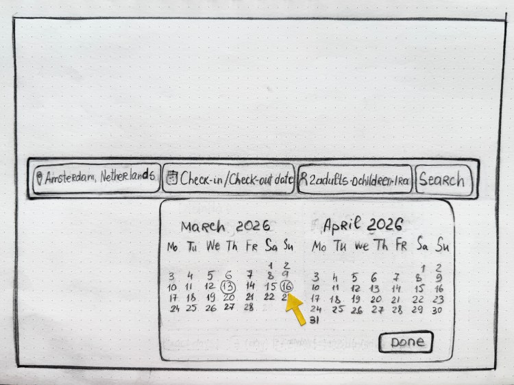
Prototype
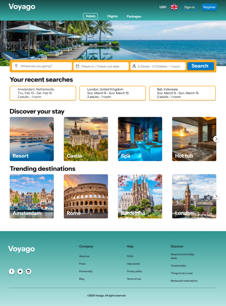


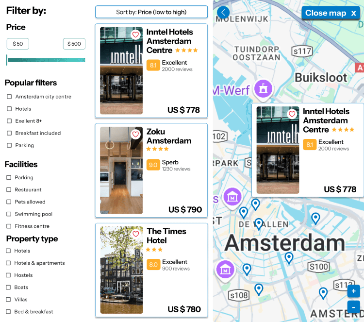
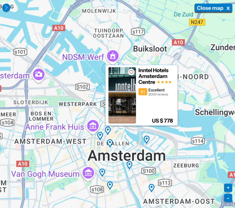


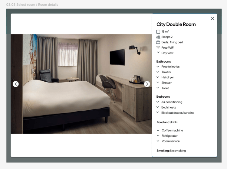


The final high-fidelity prototype was created in Figma, focusing on a streamlined, step-by step booking flow. Key screens include hotel search, results overview, hotel detail, comparison view, and a clear checkout process with a persistent summary sidebar.
The design emphasizes clarity, consistency, and ease of use, supporting quick decisions while reducing user stress. The prototype was tested with real users and refined based on feedback to ensure smooth interactions and intuitive navigation throughout the journey
Annotations

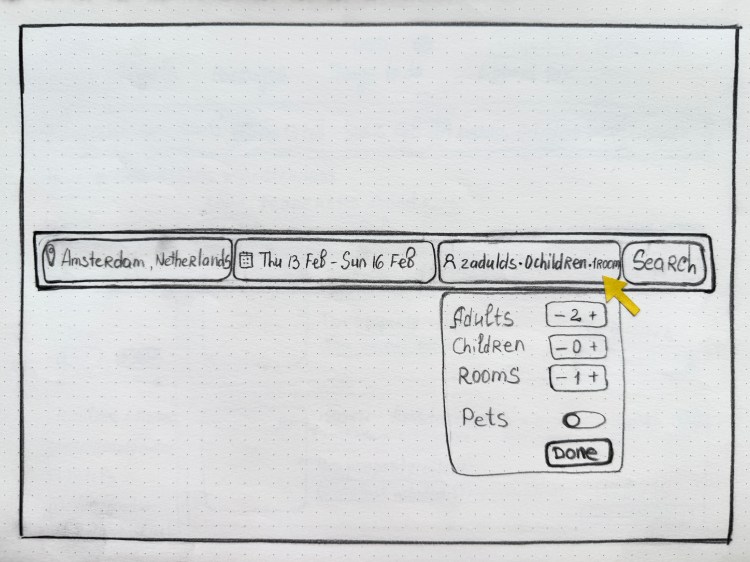
To support developers and stakeholders, I added concise annotations directly in the Figma prototype. Each note starts with a capital letter and describes key functionality or layout intention without using technical jargon. The goal was to ensure clarity, minimize ambiguity, and maintain consistency across the interface — especially in areas like filters, booking steps, and CTAs.
Summary
The booking flow was designed to feel intuitive and frictionless, following well-established UX conventions to support user confidence. Based on design logic and common usability principles, the interface allows users to move through the booking process smoothly, with features that anticipate real needs and behaviors.
The ability to go back without losing progress reinforces a sense of control and flexibility. The layout is clean and simple, with a clear information hierarchy that supports easy navigation and informed decision-making. Overall, the design effectively balances clarity and usability — supporting both confident users and those who may need more reassurance along the way.
Interested in working together?
Connect with me: LinkedIn / 📩 guryeva.elen@gmail.com
I’m always open to connecting and discussing new opportunities in UX design.
